
Docs2 min readDecember 24, 2025
Why do my images look cropped in some sections?
How aspect ratios, section settings, and responsive layouts affect cropping.
Cropping usually happens when a section is designed to keep a consistent shape (aspect ratio) across devices. That consistency protects layout quality—but it means parts of an image may be trimmed.
The main causes
- Aspect ratio mismatch: your image is, for example, 3:2 but the section expects 16:9.
- "Cover" behavior: sections often fill the available space to avoid empty gaps.
- Mobile-specific height settings: a hero that looks great on desktop may crop more on mobile.
Fix options (best → worst)
- Use the right ratio for the section (recommended).
- Change the section's image ratio/height settings (if available).
- Recompose the image so the subject sits center-safe (more "breathing room").
- Switch to a different section that supports "contain" or flexible layout.
Practical tips
- For slideshows/heroes: keep the subject centered and avoid key text near edges.
- For grids: pick a single ratio and use it everywhere (your store will look instantly more premium).
Quick troubleshooting
- If only some images crop: those images likely have different ratios than the others.
- If mobile is the problem: reduce mobile hero height or use a mobile-specific image if supported.
Next: What image sizes should I upload for best quality and speed?
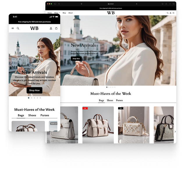
Featured theme: Fennec
Fast, responsive, SEO-ready theme built for conversion.
- Online Store 2.0 sections
- Performance-first layout
- Accessible, SEO-ready foundation
